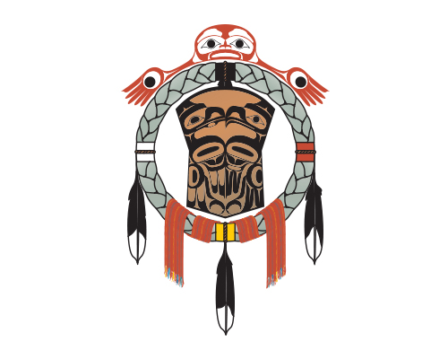
The JIBC Office of Indigenization logo, created by Haida Gwaii artist James Cowpar, reflects this concept of social justice and the design acknowledges the diversity of Indigenous Peoples. Officially unveiled at JIBC on November 19, 2004, the Indigenous Advisory Council worked closely with the artist to develop the logo.
What does the logo represent?

The coastal design of a human (at the top) welcomes and reaches out to all people in four directions.
The circle represents togetherness and unity.
The sweet grass represents the cleansing ceremony of the east, with its four-points signifying a complete connection.
Each quarter connects to form a complete circle, and the connector colours of white, red, black and yellow represent the four colours of people.
The copper shield symbolizes social organization.
The eagle and raven represent family, belonging and responsibilities, according to the practices of the clan systems. Their supernatural powers bring justice by providing meaning, understanding and solutions to problems people face, both past and present.
The Métis sash is a woven, woollen belt. Its colours reflect the variety of Métis cultures, traditions and languages. The colours represent the blood that was shed, the depth of the Métis spirit, the fertility of a great nation, the dark period of suppression and dispossession, the prospect for prosperity, and the connection to Mother Earth and the creator.
The feathers symbolize strength, balance, vision and peace.
Find the right program or course for you
We respectfully acknowledge JIBC's New Westminster campus is located on the unceded Traditional Territories of the Qayqayt, Musqueam and Coast Salish Peoples.